Tell me what the Pittsburgh flag looks like. Can’t do it? If you’re lucky, you might remember that it’s black and gold. I’m doubtful anyone reading this could redraw it from memory because it’s so forgettable. I want a flag that speaks to us, one that Pittsburghers would proudly fly outside their homes.
It’s time to redesign Pittsburgh’s official flag.
A city’s flag should represent and unite its people, and our current, badly designed flag just doesn’t do it. In 2004, the North American Vexillological Association, an organization devoted to the scholarly study of flags, rated 150 U.S. city flags. Since then, over 20 of the cities included in the study have redesigned their flag and at least five others are considering updates. In my opinion, we should too.
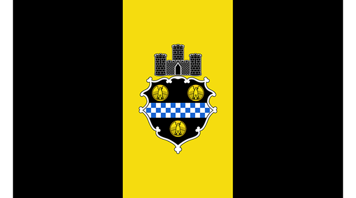
While Pittsburgh landed 24th and was given a B- rating in the Vexillological Association test, I think we could do better. Looking at the city flag, adopted in 1899, it’s hard to know what everything symbolizes. The flag features “The Great Seal of the City of Pittsburgh,” which includes William Pitt’s coat of arms and a triple-towered castle overtop, overlaid on a triband of black and gold.
A castle symbolizing a city isn’t just too literal, it’s too old. The coat of arms also has an interesting history as a botched depiction. Its decorative shield shape contains a blue-and-white checkered pattern (the uniform colors William Pitt’s family would wear to Parliament) and three golden eagles. However, eagles weren’t in the original design. In 1845, the Great Fire of Pittsburgh destroyed all documentation of the seal, and draftsmen had to redraw the seal from recollections of city residents. The original “bezants,” gold Byzantine coins symbolizing honesty, instead became eagles within golden circles.
The Great Seal’s coat of arms, this central feature of the flag, is what makes it a bad design. Most people can’t read the symbols of heraldry, nor recreate or recognize it, despite the use of this symbol throughout the city, on police cars, uniforms, and as the University of Pittsburgh logo.
But what makes for a good flag design? Luckily, the North American Vexillological Association has five principles to follow, which I’ve used to judge Pittsburgh’s design.
1. Keep It Simple: The flag should be so simple that a child can draw it from memory.
Definitely not. I can barely draw the flag as an adult. The ornamental shape of the coat of arms is especially hard to draw.
2. Use Meaningful Symbolism: The flag's images, colors, or patterns should relate to what it symbolizes.
Yes. While black and gold don’t necessarily have any symbolism, they are easily recognizable as the colors of the city. I can also easily imagine the colors to be symbolic of the steel and mining industry.
3. Use 2 or 3 Basic Colors: Limit the number of colors on the flag to three which contrast well and come from the standard color set.
Yes, this rule is followed, too. The black and gold of the triband is quite recognizable and possibly the only good thing going for the flag right now. We use these colors for all of Pittsburgh’s sports teams. which gives them authenticity as the colors of the ‘Burgh.
4. No Lettering or Seals: Never use writing of any kind or an organization's seal.
This rule is flagrantly disobeyed. We define ourselves by our sports teams, our geography, and our history as a steel producer, not as the British prime minister and soldier who founded a fort on Iroquois and Shawnee territory. It might have been the way Pittsburghers defined themselves at one point in time, but it now feels outdated.
5. Be Distinctive or Be Related: Avoid duplicating other flags, but use similarities to show connections.
Yes and no. The black and gold of the flag are distinctive. I can’t think of any other city or flag that uses those two colors. But there must be a dozen other cities that have a city’s coat of arms plopped on top of some stripes.
By this set of rules, Pittsburgh only does OK if you’re judging it for the flag’s black-and-gold stripes. And I believe you can also judge the flag by how often you see it displayed. Looking around the city, it’s hard to find a flag of Pittsburgh; you’re more likely to find one for the Steelers, Penguins, or Pirates.
Now, you might be thinking that there are more important things to do than update our city flag. But if you have a great city flag, you have an icon for the people to rally under together to do those important things. A great city flag enforces a positive mindset and united pride for a city.
Look at the city of Chicago, which has an awesome city flag that’s regularly used as the standard in vexillology. Many officers or firefighters who died in action in Chicago will have the flag of Chicago laid over their coffins instead of the American flag. Public institutions like Chicago museums even use and incorporate elements of the flag into their branding. It becomes an icon everyone can identify with, inviting loyalty and trust in the city and local government.
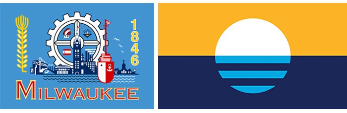
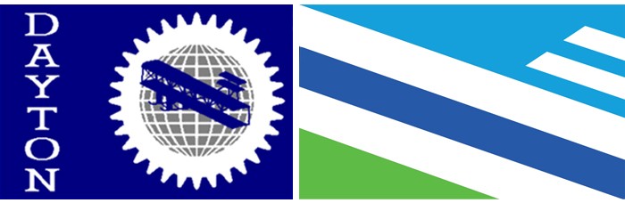
Just take a look at some of these cities that have redesigned their city flags since the North American Vexillological Association’s 2004 study:
Montpelier, Vt. redesigned by Chet Larrow
Milwaukee, Wi. redesigned by Robert Lenz
Dayton, Oh. multiple attributions
Now, those are some flags you’d want to fly.
And as a designer, this wouldn’t be complete without my own two suggestions for a new Pittsburgh flag. I wanted to be considerate and not change the flag too much, landing on these two designs:
For my first design, I simply took out Pitt’s seal and introduced some white stripes. White symbolizes the purity or cleanliness of Pittsburgh’s growing clean energy and technological industry. White can also symbolize steel and Pittsburgh’s name and history as the “Steel City.”
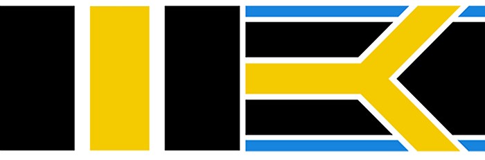
For my second design, I used gold to recreate the three rivers that define the city’s center. These “rivers of gold,” so to speak, symbolize the wealth of the city. The blue-and-white stripes on the top and bottom of the flag are the colors of William Pitt who founded the city (he can get a nod, but he doesn’t need the whole flag to be about him). But as a bonus, blue can also symbolize water or technology and intelligence. The gold crossing over the blue references Pittsburgh as the “City of Bridges.”
Now I challenge you to imagine a new city flag. What about Pittsburgh do you think is important? What flag design would you want to fly proudly?
An artist’s plea for Pittsburgh to redesign its city flag

© 2024 Pittsburgh City Paper